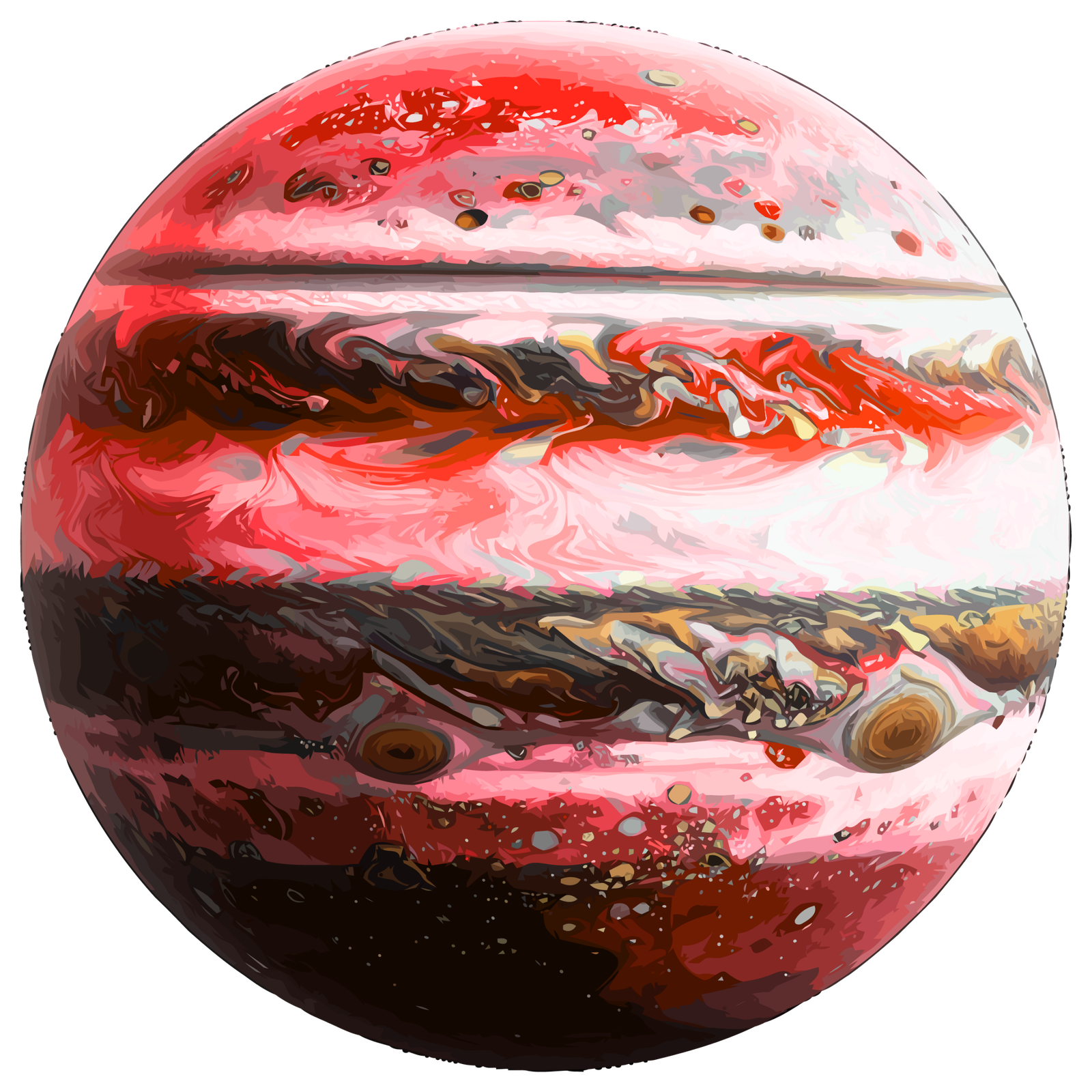
Planet Size & Gravity Comparator
Compare planetary diameters, physical proportions, surface gravity acceleration ($g$), and simulate relative body weights across the Solar System.
Surface Gravity & Weight Simulator
| Physical Property | Body 1 | Body 2 | Relative Comparison |
|---|
Visually Compare Planets & Space Bodies
Ever tried to actually picture how big Jupiter is compared to Earth? Textbooks always tell us that Jupiter is huge, but honestly, just reading numbers like “142,984 kilometers in diameter” doesnt really stick in your mind. That’s precisely why we built this Planet Size Comparison Tool here at Galaxy Chronicle.
Instead of scrolling through endless data tables, our Planet Size Comparison Tool places planets, moons, and cosmic objects side-by-side in a clean visual layout so you can immediately see the true scale of our solar system.
How to Use the Planet Size Comparison Tool
Using the Planet Size Comparison Tool is super simple and interactive, no complicated setup required:
- Select Any Two Bodies: Choose your primary planet (like Earth) and pick a secondary body (like Mars, Saturn, or even the Moon) to compare.
- Toggle Visual Scale: Watch the dynamic graphic resize in real-time to reflect their exact relative dimensions.
- Check Key Stats: Along with the visual model, the Planet Size Comparison Tool gives you straightforward stats like radius, volume ratios, and surface area differences.
- Custom Zooming: Zoom in or out to inspect fine surface details or step back to take in the massive size gaps.
Why Visualizing Planetary Scale Matters
When people think about space, it’s really hard for our human brains to comprehend cosmic scale. We live on a planet that feels huge to us, but when you put Earth next to gas giants, Earth suddenly looks like a tiny marble.
For instance, did you know that over 1,300 Earths could fit inside Jupiter? Or that the sun is so massive it accounts for about 99.8% of all the mass in the entire solar system? Using a visual helper like our Planet Size Comparison Tool brings those abstract astronomy facts to life in a way that actually makes sense.
Frequently Asked Questions
Are the sizes in this Planet Size Comparison Tool to scale?
Yeah, totally! The visual renderings directly reflect the relative planetary radiuses based on standard astronomical measurements.
Can I compare moons or dwarf planets like Pluto?
Yes! Our Planet Size Comparison Tool lets you compare major planets alongside moons like Titan or Earth’s Moon, plus dwarf planets so you can see how Pluto really stacks up.
Why does Jupiter look so much bigger than Earth even though its diameter is only 11 times larger?
That comes down to volume! Volume scales with the cube of the radius ($r^3$), so doubling a planet’s diameter makes its overall 3D volume eight times bigger.